CMI Qiita/GNPS workshop
Materials below are intended for CMI Qiita/GNPS workshop participants. They include all information covered during days 1 and 2 of the workshop.
For more information on Qiita, including Qiita philosophy and documentation, please visit Qiita website.
A description of many of the terms used in this tutorial can be found in this glossary
For general information about workshops, please visit the Center for Microbiome Innovtion website or contact the CMI directly.
Qiita tutorials:
This tutorial will walk you through creation of your account and a test study in Qiita.
Getting CMI Workshop example data
There are two separate example datasets made available to you - a processing dataset containing raw sequencing files which we will process to generate information about the identity and relative amounts of microbes in our samples (n=14), and an analysis dataset which contains a unique set of pre-processed samples (n=30) which we will use for statistical and community analyses.
Processing dataset
You can download the processing dataset directly from GitHub. These files contain 16S rRNA microbiome data for 14 human skin samples. It is a subset of data that we will use later for analysis. Real sequencing data can be tens of gigabytes in size!
The files are:
- CMI_workshop_lane1_S1_L001_R1_001.fastq.gz # 16S sequences - forward reads
- CMI_workshop_lane1_S1_L001_R2_001.fastq.gz # 16S sequences - reverse reads
- CMI_workshop_lane1_S1_L001_I1_001.fastq.gz # 16S sequences - barcodes
- sample_info.txt # The sample information file
- prep_info_16S.txt # The preparation information file
Analysis dataset
Example data that you can use for analysis are available to you directly on Qiita. You don’t need to download anything to your hard drive. Instructions how to access these data are provided in the analysis tutorial.
Setting up Qiita
Signing up for a Qiita account
Open your browser (it must be Chrome or Firefox) and go to Qiita (https://qiita.ucsd.edu).
Click on “Sign Up” on the upper-right-hand corner.

The “New User” link brings you to a page on which you can create a new account. Optional fields are indicated explicitly, while all other fields are required.

Once the form is submitted, an email will be sent to you containing instructions on how to verify your email address.
Logging into your account and resetting a forgotten password
Once you have created your account, you can log into the system by entering your email and password.

If you forget your password, you will need to reset it. Click on “Forgot Password”.
This will take you to a page on which to enter your email address; once you click the “Reset Password” button, the system will send you further instructions on how to reset your lost password.

Updating your settings and changing your password
If you need to reset your password or change any general information in your account, click on your email at the top right corner of the menu bar to access the page on which you can perform these tasks.
Studies in Qiita
Studies are the source of data for Qiita. Studies can contain only one set of samples but can contain multiple sets of raw data, each of which can have a different preparation – for example, 16S, shotgun metagenomics, and metabolomics, or even multiple preparations of the same type (e.g., a plate rerun, biological and technical replicates, etc).
In the analysis tutorial, our study contains 30 samples, each with two types of data: 16S and metabolomic. To represent this project in Qiita, we created a single study with a single sample information file that contains all 30 samples. Then, we linked separate preparation files for each data type.
Creating an example study
To create a study, click on the “Study” menu and then on “Create Study”. This will take you to a new page that will gather some basic information to create your study.

The “Study Title” has to be unique system-wide. Qiita will check this when you try to create the study, and may ask you to alter the study name if the one you provide is already in use.

A principal investigator is required, and a list of known PIs is provided. If you cannot find the name you are looking for in this list, you can choose to add a new one.
Select the environmental package appropriate to your study. Different packages will request different specific information about your samples. For more details, see the publication. For this test study for the processing tutorial, choose human-skin.
There is also an option to specify time series type (“Event-Based Data”) if you have such data. In our case, the samples come from a time series study design, so you should select “multiple intervention, real”. For more information on time series types, you can check out the in-depth tutorial on the Qiita website.
Once your study has been created, you will be informed by a green message; click on the study name to begin adding your data.

Adding sample information
Sample information is the set of metadata that pertains to your biological samples: these are the measured variables that are motivating you to look for response variables in the microbiome. IMPORTANT: your metadata are your study; it is imperative that those data are consistent, correct, and sufficiently detailed. (To learn more, including how to format your own sample info file, check out the in-depth documentation on the Qiita website.)
The first point of entrance to a study is the study description page. Here you will be able to edit the study info, upload files, and manage all other aspects of your study.

Since we are using a practice set of data, under “Study Tags” write “Tutorial” and select “Save Tags”. As part of our routine clean up efforts, this tag will allow us to find and remove studies and analyses generated using the template data and information.

The first step after study creation is uploading files. Click on the “Upload Files” button: as shown in the figure below, you can now drag-and-drop files into the grey area or simply click on “select from your computer” to select the fastq, fastq.gz or txt files you want to upload.
Note: Per our Terms of Condition for use, by uploading files to Qiita you are certifying that they do not contain: 1) Protected health information within the meaning of 45 Code of Federal Regulations part 160 and part 164, subparts A and E; see checklist 2) Whole genome sequencing data for any human subject; HMP human sequence removal protocol 3) Any data that is copyrighted, protected by trade secret, or otherwise subject to third party proprietary rights, including privacy and publicity rights, unless you are the owner of such rights or have permission from the rightful owner(s) to transfer the data and grant it to Qiita, on behalf of the Regents of the University of California, all of the license rights granted in our Terms.
Uploads can be paused at any time and restarted again, as long as you do not refresh, navigate away from the page, or log out of the system from another browser window.
To proceed, drag the file named “sample_info.txt” into the upload box. It should upload quickly and appear below “Files” with a checkbox next to it below.

Once your file has uploaded, click on “Go to study description” and, once there, click on the “Sample Information” tab. Select your sample information from the dropdown menu next to “Upload information” and click “Create”.

If something is wrong with the sample information file, Qiita will let you know with a red banner at the top of the screen.

If the file processes successfully, you should be able to click on the “Sample Information” tab and see a list of the imported metadata fields.

Note: The warning is to let you know this study is missing columns that are required for EBI-ENA submission. For more information you can visit the Send data to EBI-ENA information page.
To check out the different metadata values select the “Sample-Prep Summary” tab. On this page, select a metadata column to visualize in the “Add sample column information to table” dropdown menu and click “Add column.”

Next, we’ll add 16S raw data and process it.
Next: Adding a preparation template and linking it to raw data
Now, we’ll upload some actual microbiome data to explore. To do this, we need to add the data themselves, along with some information telling Qiita about how those data were generated.
Adding a preparation template and linking it to raw data
Where the sample info file has the biological metadata associated with your samples, the preparation info file contains information about the specific technical steps taken to go from sample to data. Just as you might use multiple data-generation methods to get data from a single sample – for example, target gene sequencing and shotgun metagenomics – you can have multiple prep info files in a single study, associating your samples with each of these data types. You can learn more about prep info files at the Qiita documentation.
Go back to the “Upload Files” interface. In the example data, find and upload the 3 “.fastq.gz files” and the “prep_info_16S.txt” file.

These files will appear under “Files” when they finish uploading.
Then, go to the study description. Now you can click the “Add New Preparation” button. This will bring up the following dialogue:

Select “prep_info_16S.txt” from the “Select file” dropdown, and “16S” as the data type. Optionally, you can also select one of a number of investigation types that can be used to associate your data with other like studies in the database. Click “Create New Preparation”.
You should now be brought to a “Processing” tab of your preparation info:

By clicking on the “Summary” tab on this page you can see the preparation info that you uploaded.

As the owner of the study, you will also have the options to delete or deprecate the preparation. Once an analysis has been created from any object in a preparation, you will be unable to delete the prep. Deprecating the preparation lets others know it is an older version.
In addition, you should see a “16S” button appear under “Data Types” on the menu to left:

You can click this to reveal the individual prep info files of that data type that have been associated with this study:

If you have multiple 16S preparations (for example, if you sequenced using several different primer sets), these would each show up as a separate entry here.
Now, you can associate the sequence data from your study with this preparation.
Select the processing tab again. In the prep info dialogue, there is a dropdown menu below the words No files attached to this preparation, labeled “Select type”. Click “Choose a type” to see a list of available file types. In our case, we’ve uploaded FASTQ-formatted files for all samples in our study, so we will choose “FASTQ - None”. In some cases outside of this tutorial, you may have per sample FASTQ files, so take care in considering which data type you are handling.
Magically, this will prompt Qiita to associate your uploaded files with the corresponding samples in your preparation info. (Our prep info file has a column named run_prefix, which associated the sample_name with the file name prefix for that particular sample).
You should see this as filenames showing up in the green: raw barcodes (file with I1 in its name), raw forward seqs (R1 in name) and raw reverse seqs (R2 in name) columns below the import dropdown. You’ll want to give the set of these FASTQ files a name (Add a name for the file field below Select type: FASTQ - None), and then click “Add files” below.

That’s it! Your data are ready for processing.
Exploring the raw data
Click on the 16S menu on the left. Now that you’ve associated sequence files with this prep, you’ll have a “Processing network” displayed:

If you see this message:

It means that your files need time to load. Refresh your screen after about 1 minute.
Your collection of FASTQ files for this prep are all represented by a single object in this network, called “[user’s_name] (FASTQ)” in the example. Click on the object.
Now, you’ll have a series of choices for interacting with this object. You can click “Edit” to rename the object, “Process” to perform analyses, or “Delete” to delete it. In addition, you’ll see a list of the actual files associated with this object.

Scroll to the bottom, and you’ll also see an option to generate a summary of the object.

If you click this button, it will be replaced with a notification that the summary generation has been added to the processing queue.
To check on the status of the processing job, you can click the rightmost icon at the top of the screen:

This will open a dialogue that gives you information about currently running jobs, as well as jobs that failed with some sort of error. Please note, this dialogue keeps the entire history of errors that Qiita encountered for your jobs, so take notice of dates and times in the Heartbeat column.

The summary generation shouldn’t take too long. You may need to refresh your screen. When it completes, you can click back on the FASTQ object and scroll to the bottom of the page to see a short peek at the data in each of the FASTQ files in the object. These summaries can be useful for troubleshooting.

Now, we’ll process the raw data into something more interesting.
Processing 16S data
Scroll back up and click on the “CMI tutorial - 14 skin samples(FASTQ)” artifact, and select “Process”. Below the files network, you will now see a “Choose command” dropdown menu. Based on the type of object, this dropdown menu will give a you a list of available processing steps.
For 16S “FASTQ” objects, the only available command is “Split libraries FASTQ”. The converts the raw FASTQ data into the file format used by Qiita for further analysis (you can read more extensively about this file type here).
Select the “Split libraries FASTQ” step. Now, you will be able to select the specific combination of parameters to use for this step in the “Choose parameter set” dropdown menu.

For our files, choose “Multiplexed FASTQ; Golay 12 base pair reverse complement mapping file barcodes with reverse complement barcodes”. The specific parameter values used will be displayed below. For most raw data coming out of the Knight Lab you will use the same setting.
Click “Add Command”.
You’ll see the files network update. In addition to the original white object, you should now see the processing command (represented in yellow) and the object that will be produced from that command (represented in grey).

You can click on the command to see the parameters used, or on an object to perform additional steps.
Next we want to trim to a particular length, to ensure our samples will be comparable to other samples already in the database. Click back on the “demultiplexed (Demultiplexed)”. This time, select the Trimming operation. Currently, there are seven trimming length options. Let’s choose “100 basepairs”, which trims to the first 100bp, for this run, and click “Add Command”.

Click “Add Command”, and you will see the network update:

Note that the commands haven’t actually been run yet! (We’ll still need to click “Run” at the top.) This allows us to add multiple processing steps to our study and then run them all together.
We’re going to process our sequence files using two different workflows. In the first, we’ll use a conventional reference-based OTU picking strategy to cluster our 16S sequences into OTUs. This approach matches each sequence to a reference database, ignoring sequences that don’t match the reference. In the second, we will use deblur, which uses an algorithm to remove sequence errors, allowing us to work with unique sequences instead of clustering into OTUs. Both of these approaches work great with Qiita, because we can compare the observations between studies without having to do any sort of re-clustering!
The closed-reference workflow
To do closed reference OTU picking, click on the “Trimmed Demultiplexed (Demultiplexed)” object and select the “Pick closed-reference OTUs” command. We will use the “Defaults” parameter set for our data, which are relatively small. For a larger data set, we might want to use the “Defaults - parallel” implementation.

By default, Qiita uses the GreenGenes 16S reference database. You can also choose to use the Silva 119 18S databsase, or the UNITE 7 fungal ITS database.
Click “Add Command”, and you will see the network update:

Here you can see the blue “Pick closed-reference OTUs” command added, and that the product of the command is a BIOM-formatted OTU table.
That’s it!
The deblur workflow
The deblur workflow is only marginally more complex. Although you can deblur the demultiplexed sequences directly, “deblur” works best when all the sequences are the same length. By trimming to a particular length, we can also ensure our samples will be comparable to other samples already in the database.
Click back on the “Trimmed Demultiplexed (Demultiplexed)” object. This time, select the Deblur operation. Choose “Deblur” from the “Choose command” dropdown, and “Defaults” for the parameter set.

Add this command to create this workflow:

Now you can see that we have the same “Trimmed Demultiplexed (Demultiplexed)” object being used for two separate processing steps – closed-reference OTU picking, and deblur.
As you can see, “deblur” produces two BIOM-formatted OTU tables as output. The “deblur reference hit table (BIOM)” contains deblurred sequences that have been filtered to try and exclude things like organellar mitochondrial reads, while “deblur final table (BIOM)” has all the sequences.
Running the workflow
Now, we can see the whole set of commands and their output files:
Click “Run” at the top of the screen, and Qiita will start executing all of these jobs. You’ll see a “Workflow submitted” banner at the top of your window.
The full workflow can take time to load depending on the amount of samples and Qiita workload. You can keep track of what is running by looking at the colors of the command artifacts. If yellow, the commands are being run now. If green, the commands have successfully been run. If red, the commands have failed.

Once objects have been generated, you can generate summaries for them just as you did for the original “FASTQ” object.
The summary for the “demultiplexed (Demultiplexed)” object gives you information about the length of sequences in the object:

The summary for a BIOM-format OTU table gives you a table summary, details regarding the frequency per sample, and a histogram of the number of features per sample:

Analysis of Closed Reference Process
To create an analysis, hover over “Analysis” on the top menu and select “Create new analysis” from the drop down menu.
This will take you to a list of studies with samples available to you for analysis, divided between your studies and publicly available studies (“Public Studies”).

Find the “CMI workshop analysis” study in Public Studies. You can use the search window at the top right, or filter by tags (“CMIWorkshop” tag). Click the green plus sign at the left of the row under “Expand for analysis”. This will expand the study to expose all the objects from that study that are available to you for analysis.

To look more closely at the details of the artifact, select “Per Artifact (1).” Here you can add each of these objects to the analysis by selecting the “Add” button. We will just add the Closed Reference OTU table object by clicking “Add” in that row.

Now, the second-right-most icon at the top bar should turn green, indicating that there are samples selected for analysis.

Clicking on the icon will take you to a page where you can refine the samples you want to include in your analysis. Here, all 30 of our samples are currently included:

You could optionally exclude particular samples from this set by clicking on “Show/Hide samples”, which will show each individual sample name along with a “remove” option. (Removing them here will mask them from the analysis, but will not affect the underlying files in any way.)
This should be good for now. Click the “Create Analysis” button, enter a name and description, then click “Create Analysis”.

This brings you to the processing network page. This may take 2 to 5 minutes to load. When it has loaded, you can analyze the data.

Before we process the data, let’s have a look at the summary of the contents of the biom file. Select the “dflt_name (BIOM)” artifact to see a summary of this file displaying a table summary, details regarding the frequency per sample, histogram of the number of features per sample:

As you can see, this file contains 30 samples with roughly 36,000 features, in our case, picked-OTUs (or operational taxanomic unit).
Now we can begin analyzing these samples. Let’s go ahead and select “dflt_name (BIOM)” then select “Process”. This will take us to the commands selection page. Once there, the commands pull down tab can be accessed which will display thirty-eight actions.

The text in brackets is the actual underlying commands from QIIME2. We will now go through the use of some of the most-used commands which will enable you to generate summaries, plot your data, and calculate statistics to help you get the most out of your data.
Rarefying Data
For certain analyses such as those we are about to conduct, the data should be rarefied. This means that all the samples in the analysis will have their features, in this case OTUs, randomly subsampled to the same desired number, reducing potential alpha and beta diversity biases. Samples with fewer than this number of features will be excluded, which can also be useful for excluding low abundance samples like blanks. To choose a good cutoff for your data, view the histogram that was made when we generated the summary of the data.

An appropriate cutoff would exclude clear outliers, but retain most of the samples. Here we have already removed blanks from our data and eliminated the outliers prior to analysis so we will just use the minimum number of features observed in our samples (11030) as the cutoff.
To rarefy the data, select “Rarefy table” from the drop-down menu. The parameters will appear below the workflow diagram:

Several parameters will have only one option which will be automatically selected for you. In the field, “The total frequency that each sample should be rarefied to…(sampling depth)”, we will specify the number of features to rarefy our samples to. Enter “11030” in this box, and click “Add Command”.

Click the “Run” button above the workflow network to start the process of rarefaction. You can now view your jobs that are running by clicking on the server button in the top-right corner of the screen:

The view will return to the original screen, while the rarefied feature-table generation job runs. Your browser will automatically refresh every 15 seconds until the “rarefied table (BIOM)” artifact appears:

Select the newly generated “rarefied_table (BIOM)” artifact. This time instead of seeing a histogram of the rarefied samples, you instead see a brief summary confirming that your samples have all be rarefied to the same depth. Now that the data are rarefied, we can begin the analysis.
Taxa Bar Plots
When creating a 16S closed-reference BIOM table in Qiita, each sequence is matched to the Greengenes database using a 97% sequence identity threshold, and assigned a taxonomy (See this section for a refresher on 16S data). This enables us to display this data to view the percentage of each taxa within each sample.
When using “Deblurred” data, there is no taxa assignment since features are kept as individual error-corrected sequences, so if you are referencing this tutorial with your own deblurred data you can skip to the next section “Alpha Diversity Analysis”.
To display the taxonomic profiles of our samples, we will select our rarefied table artifact, and click “Process”. The same processing view we saw previously now appears, so click on “Visualize taxonomy with an interactive bar plot” from the drop-down menu to arrive at the following view:

All of the parameters for this command are fixed so simply click “Add Comand” to continue. Once the command is added the workflow will appear:

Click the run button to start the process. Once the “visualization (q2_visualization)” artifact is generated you should see this screen:

Once the q2 visualization artifact is chosen in the network, the taxa barplot will appear below. The taxa plots offers visualization of the makeup of each sample. Each color will represent a different taxon and each column a different sample. It will have four pull-down menus: “Taxonomic Level,” “Color Palette,” and two “Sort Samples By” options.

The “Taxonomic Level” menu allows you to view the taxa within your samples at different specificities. There are 7 level options: 1- Kingdom, 2- Phylum, 3- Class, 4- Order, 5- Genus, 6- Species, 7- Subspecies.
The “Color Palette” menu allows you to change the coloring of your taxa barplot. You can select through “Discrete” palettes in which each taxa is a different color or “Continuous” palettes in which each taxa is a different shade of one color.
The “Sort Sample By” menus allow you to sort your data either by sample metadata or taxonomic abundance and either by ascending or descending order.
Alpha Diversity Analysis
Now, let’s analyze the alpha diversity of your samples. Alpha diversity metrics describe the diversity of features within a sample or a group of samples. This is used to analyze the diversity within rather than between samples or a group of samples.
Observed Operational Taxonomic Units
One type of analysis for alpha diversity, and the simplest, is looking at the number of observed, unique features, or OTUs in this example, also known as feature richness. This type of analysis will provide the number of unique OTUs found in a sample or group of samples.
To perform an alpha diversity analysis of feature richness, select the rarefied “rarefied table (BIOM)” artifact in the processing network and select “Process”. Select “Alpha diversity [alpha]” from the drop-down menu. The parameters will appear below the workflow diagram:

Several parameters have been automatically selected for you since these options cannot be changed. In the field, “The alpha diversity metric… (metric)”, we will specify the alpha diversity metric to run in our analysis. Select “Number of distinct features” from the drop-down menu in this box, and click “Add Command”.
Once the command is added the workflow should appear as follows:

Click the run button to start the process of the alpha diversity analysis. The view will return to the original screen, while the alpha diversity analysis job runs.
Shannon Diversity Index
Another alpha diversity metric commonly used is the Shannon diversity index. In addition to feature richness, this metric considers the abundance of each taxon relative to the total abundance across all taxa in a sample. Therefore, this metric takes into account both feature richness and abundance.
To perform an alpha diversity analysis using the Shannon diversity index, select the “rarefied table (BIOM)” artifact in the processing network and select “Process”. Select “Alpha diversity [alpha]” from the drop-down menu. The parameters will appear below the workflow diagram as previously. Also as before, several parameters have been automatically selected for you. In the field, “The alpha diversity metric… (metric)”, select “Shannon’s index” from the drop-down menu in this box, and click “Add Command”.
Once the command is added the workflow should appear as follows:

Click the run button to start the process of the alpha diversity analysis. The view will return to the original screen, while the alpha diversity analysis job runs.
Faith’s Phylogenetic Diversity Index
The final alpha diversity analysis in this tutorial uses Faith’s phylogenetic diversity index. This index also measured abundance and diversity but considers the phylogenetic distance spanning all features in a sample. The results can also be displayed as a phylogeny, rather than as a plot.
To perform an alpha diversity analysis using Faith’s phylogenetic diversity index, select the “rarefied table (BIOM)” artifact in the processing network and select “Process”. Select “Alpha diversity (phylogenetic)” with the Qiime2 command of “alpha phylogenetic” not “alpha phylogenetic old” from the drop-down menu. The parameters will appear below the workflow diagram:

Several parameters have been automatically selected for you. For example, in the field, “The alpha diversity metric… (metric)”, “Faith’s Phylogenetic Diversity” has already been chosen from the drop-down menu in this box. In the “Phylogenetic tree” field select “/databases/gg/13_8/trees/97_otus_no_none.tree” then click “Add Command”.
Once the command is added the workflow should appear as follows:

Click the run button to start the process of the alpha diversity analysis. The view will return to the original screen, while the alpha diversity analysis job runs.
Alpha Diversity Outputs
Each alpha diversity analysis will output an interactive boxplot that shows how that alpha diversity metric correlates with different metadata categories:

To change the category, choose the “Category” pull-down menu and choose the metadata category you would like to analyze:

You will also be given the outcomes to Kruskal-Wallis tests:

Beta Diversity Analysis
One can also measure beta diversity in Qiita. Beta diversity measures feature turnover among samples (i.e., the diversity between samples rather than within each sample). This is used to compare samples to one another.
Bray-Curtis Dissimilarity
One commonly used beta diversity metric is Bray-Curtis dissimilarity. This metric quantifies how dissimilar samples are to one another.
To perform an anlaysis of beta diversity using the Bray-Curtis dissimilarity metric, select the “rarefied table (BIOM)” artifact in the processing network and select “Process”. Then select “Beta diversity” from the drop-down menu. The parameters will appear below the workflow diagram:

Several parameters have been automatically selected for you. In the field, “The beta diversity metric… (metric), we will specify the beta diversity analysis to run. Select “Bray-Curtis dissimilarity” from the drop-down menu in this box, and click “Add Command”.
To create a principal coordinates plot of the Bray-Curtis dissimilarity distance matrix, select the “distance matrix (distance matrix)” artifact and select “Process”. Select “Perform Principal Coordinate Analysis (PCoA)” from the drop-down menu. The parameters will appear below the workflow diagram:

All of the parameter have automatically selected for you just click “Add Command”.
Once the command is added the workflow should appear as follows:

Click the run button to start the process of the beta diversity analysis. The view will return to the original screen, while the beta diversity analysis job runs.
Unweighted UniFrac Analysis
Another commonly used distance metric for measuring beta diversity is unweighted UniFrac distance. Unweighted refers to that the metric considers only feature richness and not abundance, when comparing samples to one another. This differs from the weighted UniFrac distance metric, which takes into account both feature richness and abundance, for each sample.
To perform unweighted UniFrac analysis, select the “rarefied table (BIOM)” artifact in the processing network and select “Process”. Then select “Beta diversity (phylogenetic)” from the drop-down menu. The parameters will appear below the workflow diagram:

Most of the parameters have been automatically selected for you, but you will need to select the phylogenetic tree to use. Click on the dropdown next to “Phylogenetic tree:” and select “/databases/gg/13_8/trees/97_otus_no_none.tree” and then click “Add Command”.
To create a principal coordinates plot of the unweighted Unifrac distance matrix, select the “distance_matrix (distance_matrix)” artifact that will be generated using Unweighted UniFrac distance. Note that, unless you rename each distance matrix (see below: Altering Workflow Analysis Names), they will appear identical until you select them to view their provenance information. Once you have selected the distance matrix artifact, select “Perform Principal Coordinate Analysis (PCoA)” from the drop-down menu. The parameters will appear below the workflow diagram:

All of the parameters have been automatically selected for you just click “Add Command”. Once the command is added the workflow should appear as follows:

Click the run button to start the process of the beta diversity analysis. The view will return to the original screen, while the beta diversity analysis job runs.
Principal Coordinate Analysis
Clicking on the “pcoa (ordination_results)” (Principal Coordinate Analysis) artifact will open an interactive visualization of the similarity among your samples. Generally speaking, the more similar the samples with respect to their features, the closer the are likely to be in the PCoA ordination plot. The Emperor visualization program offers a very useful way to explore how patterns of similarity in your data associate with different metadata categories.
Once the Emperor visualization program loads, the PCoA result will look like:

You will see tabs including “Color”, “Visibility”, “Opacity”, “Scale”, “Shape”, “Axes”, and “Animations”.
Under “Color” you will notice two pull-down menus:

If you click on the pull-down that says “Select a Color Category” you can select a metadata category that will color the samples by the entries in that metadata category.. Under “Classic QIIME Colors”, you can select how each group will be colored.
Under the “Visibility” tab you will notice 1 pull-down menu:

If you click on the pull-down for “Select a Visibility Category” you can select which group or groups will be displayed on the PCoA plot. Please note that if you remove the visibility of any samples this does not recalculate the distances between other samples. Removing samples can result in a plot that is misleading.
Under the “Opacity” tab you will notice 1 pull-down menu:

If you click on the pull-down for “Select an Opacity Category” you can select the categories in which the opacity will change on the PCoA plot. Once chosen, these groups will be displayed under “Global Scaling” and, when selected, you can change the opacity of each group separately. Under “Global Scaling” you can change the opacity of all of the samples.
Under the “Scale” tab you will notice 1 pull-down menu:

If you click on the pull-down for “Select a Scale Category” you can choose the grouping of your samples. Under “Global Scaling” you can change the point size for each group separately on the PCoA plot, or change the global scaling to change the point size for all of the samples.
Under the “Shape” tab you will notice 1 pull-down menu:

If you click on the pull-down for “Select a Shape Category” and select a metadata category, you can alter the shape of each group on the PCoA plot.

Under the “Axes” tab you will notice 5 pull-down menus:

The first 3 pull-down menus located under “Visible” allow you to change the axis that are being displayed. The “Axis and Labels Color” menu allow you to change the color of your axis and label of the PCoA. The “Background Color” menu allows you to change the color of the background of the PCoA. The % Variation Expanded graph displays how different the most dissimilar samples are by percentage for each axis that can be used.
Under the “Animations” tab you will notice 2 pull-down menus:

If you click the pull-down for “Category to sort samples” you can choose the category that you will be sorting the samples by. By selecting the pull-down menu for “Category to group sample” you can choose the category that you will be grouping the samples by.
Beta Diversity Group Significance
Another way to study the beta diversity is by measuring the beta diversity group significance. Beta diversity group significance measures whether groups of samples are significantly different from one another using a permutation-based statistical test. Sample groups are designated by metadata variables.
If you have completed the tutorial up to this point, you can begin analysis of beta diversity group significance from one of your beta diversity distance matrices (jump down two paragraphs). Here we begin with the rarefied feature-table. To perform a beta group significance analysis, select the “rarefied table (BIOM)” artifact in the processing network and select “Process”. Select “Beta diversity” from the drop-down menu. The parameters will appear below the workflow diagram:

Several parameters have been automatically selected for you. In the field, “The beta diversity metric… (metric)”, we will specify the beta diversity distance metric to use in our analysis. Note that if you attempt to create a distance matrix that already exists in the Processing network, you will get an error stating such. For example, if you have already created a beta diversity distance matrix using the Bray-Curtis dissimilarity metric, you will have to select a unique metric here (e.g., “Aitchison distance”). In the “Phylogenetic tree” field enter “/databases/gg/13_8/trees/97_otus.tree”, and click “Add Command”.
To create the beta group significance analysis, select the “distance_matrix (distance_matrix)” artifact of interest in the Processing network, and select “Beta diversity group significance” from the drop-down menu. The parameters will appear below the workflow diagram:

Several parameters have been automatically selected for you. In the “Metadata column to use” field we will specify the category from the metadata file to be used for determining significance between groups (e.g., subject). Using the “Perform pairwise tests…” checkbox we can indicate if we would like the group significance to be run “Pairwise”, otherwise the analysis will be done across all groups (i.e., Non-pairwise). Note that for metadata variables for which there are only two groups, this distinction makes no difference. In the field, “The group significance test… (method)”, we will specify the correlation test that will be applied (e.g., PERMANOVA [Permutational multivariate analysis of variance]). Then click “Add Command”. Once the command is added the workflow should appear as follows:

Click the run button to start the process of the beta diversity group significance analysis. The view will return to the original screen, while the beta diversity group significance analysis job runs.
Beta Group Significance Output Analysis
Once the beta group significance “visualization (q2_visualization)” artifact is chosen in the network, the beta diversity group significance Overview, which in our case shows results from the PERMANOVA (i.e., across all groups) and Group significance plots will appear:

The results from pairwise PERMANOVA tests will also be displayed if included in the analysis:

The command ‘Beta diversity group significance’ provides PERMANOVA that can be run on a single categorical metadata variable. If you instead would like to provide multiple terms in the form of an equation, you can use the command ‘adonis PERMANOVA test for beta group significance’. This latter command implements the ‘adonis’ function from the R package, vegan.
Filtering Data
Using Qiita you can also filter your data. This allows you to filter out samples.
To filter the data, select the “rarefied table (BIOM)” artifact in the processing network and select “Process”. Then select “Filter samples from table” from the drop-down menu. The parameters will appear below the workflow diagram:

Several parameters have been automatically selected for you. In the “SQLite WHERE-clause” field we are filtering out all samples except for certain samples. In this case we wanted to filter out all samples except those in which subject = 'Volunteer 3', and click “Add Command”.
If instead you want to filter out all of Volunteer 3’s samples, either use the SQLite WHERE-clause above while also checking the box “If true, the samples selected… will be excluded”, or alternatively use the SQlite WHERE-clause subject != 'Volunteer 3', and click “Add Command”. If you want to filter for samples containing an apostrophe, write it out in the following format: subject = \"Volunteer 3's samples\".
Keep in mind that all fields are case sensitive.
Click “Run” to execute the filtering process.
An example of how you can use filtering in your analysis is explained in the following “Filtered Unweighted UniFrac Analysis” section.
Filtered Unweighted UniFrac Analysis
By filtering, you can perform unweighted UniFrac analysis but this time without certain sample.
After filtering your data (shown in the previous “Filtering Data” section), you can perform a beta diversity analysis by selecting the “filtered_table (BIOM)” in the Processing network and clicking “Process”. Select “Beta diversity (phylogenetic)” from the drop-down menu. The parameters will appear below the workflow diagram:
All of the parameters have been automatically selected for you, just click “Add Command”.
To create a principal coordinates plot of the unweighted Unifrac distance matrix, select the “distance_matrix (distance_matrix)” artifact that you set up above, and select “Perform Principal Coordinate Analysis (PCoA)” from the drop-down menu. The parameters will appear below the workflow diagram:

Most of the parameters have been automatically selected for you, but you will need to select the phylogenetic tree to use. Click on the dropdown next to “Phylogenetic tree:” and select “/databases/gg/13_8/trees/97_otus_no_none.tree” and then click “Add Command”. Once the command is added the workflow should appear as follows:

Click the run button to start the process of the beta diversity analysis. The view will return to the original screen, while the beta diversity analysis job runs.
Altering Workflow Analysis Names
To alter the name of a result, click the artifact then use the edit button on the processing network page.

This will cause a window to pop-up where you can input the name you’d like to replace it with.

Analysis of Deblur Processed Data
Creating an analysis of your deblurred data is virtually the same as the process for the Closed Reference data, but there are a few important differences to note.
First, because the Deblur process creates two separate BIOM tables, you should make a note of the specific object ID number for the specific artifact you want to use. In my case, that’s ID 33331, the deblurred table with “only-16S” reads.

The specific ID for your table will be unique. You can use it to select the correct table for analysis.
Qiita employs Deblur on trimmed sequences (UC San Diego studies are typically processed with 90, 100, and 150 nt) with no minimum read threshold count, followed by insertion of output sequences into the latest (Aug 2013) 99% OTU tree from GreenGenes using SATÉ-Enabled Phylogenetic Placement (SEPP) as part of the QIIME2 q2-fragment-insertion plugin.
In addition, Deblur in Qiita uses a reduced threshold of 1 for sequence abundance across all samples, rather than the default value of 10 used in Deblur outside of Qiita. The single read threshold was chosen (rather than the default 10 read threshold) to support the best practice of setting a custom minimum read threshold that is suitable to your single-study analysis or meta-analysis. This can be done using the command, ‘Filter features from table’.
Creating a Meta-Analysis
One of the most powerful aspects of Qiita is the ability to compare your data with hundreds of thousands of samples from across the planet. Right now, there are over 230,000 samples publicly available for you to explore:

(You can get up-to-date statistics by clicking “Stats” under the “More Info” option on the top bar.)
Creating a meta-analysis is just like creating an analysis, except you choose data objects from multiple studies. Let’s start creating a meta-analysis by adding the Closed-Reference OTU table we generated in the processing tutorial to a new analysis. Select “Create new analysis” from the Analysis drop-down menu. Find the study you created for the processing tutorial under “Your studies”, and click the green circle to show artifacts from that study. There should be three artifacts, one “Pick closed-reference OTUs” and two “Deblur” feature-tables. Select “Per artifact” for the “Pick closed-reference OTUs” to expand the list of artifacts associated - in our case there is only one. Select “Add” to add this feature-table to our meta-analysis.
Next, we’ll look for some additional data to compare against.
You noticed the “Other Studies” table below “Your Studies” when adding data to the analysis. (Sometimes this takes a while to load - please be patient.) These are publicly available data for you to explore, and each should have processed data suitable for comparison to your own (i.e., same trim length and method for calling features, etc.).
There are a couple tools provided to help you find useful public studies.
First, there are a series of “tags” listed at the top of the window:

There are two types of tags: admin-assigned (yellow), and user-assigned (blue). You can tag your own study with any tag you’d like, to help other users find your data. For some studies, Qiita administrators will apply specific reserved tags to help identify particularly relevant data. The “GOLD” tag, for example, identifies a small set of highly-curated, very well-explored studies. If you click on one of these tags, all studies not associated with that tag will disappear from the tables.
Second, there is a search field that allows you to filter studies in real time. Try typing in the name of a known PI, or a particular study organism – the thousands of publicly available studies will be filtered down to something that is easier to look through.

Let’s try comparing our data (i.e., from 14 human skin samples) to the “Global Gut” dataset of human microbiomes from the US, Africa, and South America from the study “Human gut microbiome viewed across age and geography” by Yatsunenko et al. We can search for this dataset using the DOI from the paper: 10.1038/nature11053. Once the study appears, click the green circle as above to view the artifacts from that study; there should be several. Select “Per artifact” for the table that was processed the same way as yours above - “Pick closed-reference OTUs… Trimming (length:100)”.

Add the closed reference OTU table from this study to your analysis. You should now be able to click the green analysis icon in the upper right and see both your own OTU table and the public study OTU table in your analysis staging area:
You can now click “Create Analysis” just as before to begin specifying analysis steps. This time, let’s jump straight to calculating beta diversity. To try something new, rather than rarefy prior to calculating beta diversity as above, we can do it simultaneously and using an iterative rarefaction process as to get a better estimate of real differences among samples. Select “Beta diversity rarefaction” from the drop-down menu. We will only change a few of the parameters: In the field, “The beta diversity metric… (metric)”, select “Unweighted UniFrac”. For “The total frequecy that each sample should be rarefied to… (sampling depth)”, enter a rarefaction depth of 2118 - the observed minimum number of features in your processing tutorial data. Then click “Add command”, and “Run”.

Because you’ve now expanded the number of samples in your analysis by more than an order of magnitude, this step will take a little longer to complete. But when it does, a PCoA ordination plot will be generated immediately and you will be able to use Emperor to explore the samples in your test dataset to samples from around the world!

Note that in this plot, each sample point has a cloud that represents the iterative rarefaction process in this analysis. When samples are colored by the metadata variable “geo_loc_name” you can see that the “unknown” or human skin samples from our processing tutorial fall to one end of the distribution of gut samples from the larger Yatsunenko study.
Shotgun metagenomics is an alternative approach to amplicon sequencing that provides information at the genomic level, rather than for single loci such as 16S, 18S, and the fungal ITS region. In addition to providing finer resolution with respect to taxonomic classification, metagenomics provides functional data that allows for more comprehensive analyses of microbial communities. We are currently working to make available additional metagenomic tools in Qiita. Below we describe how to use Woltka to produce taxonomic profiles for shotgun metagenomic data, and then move to common downstream analyses of alpha- and beta-diversity.
Processing Shotgun Metagenomic Data
We will start by creating a new study with shotgun metagenomic data for 23 human fecal samples subsetted from the American Gut Project. As we did for amplicon data, go to the study drop-down menu and select ‘Create Study’. Complete the necessary fields similar as shown below.

Once the study has been created, click on the study name in the green banner to go to the study page. Click on ‘Upload Files’, and upload the contents of the shotgun data.

Once the files are uploaded, click on ‘Sample Information’ on the left side of the screen and select the sample information file ‘qiita_shotgun_metagenomic_tutorial_sample_info.txt’ and click ‘Create’.

Once complete, you may need to refresh your screen to see the added option of ‘Add New Preparation’. Click ‘Add New Preparation’ and give the preparation a name of your choosing. Select the prep info file, ‘qiita_shotgun-metagenomic_tutorial_prep_info.txt’, and select ‘metagenomic’ in the first drop-down menu, and ‘WGS’ (whole genome sequencing) in the second. Then click ‘Create New Preparation’.

This will create a new preparation under ‘Data Types’. You can click on the new preparation which will show the name of your preparation. You can click on this preparation or the page will automatically open the preparation once you create it. Of the new options you should select ‘per_sample_FASTQ - None’, and give the files a name. Then click ‘Add Files’.

Once your sequence files are added, you should see a processing network with an artifact representing the sequence data.

We will now process the sequence data using Woltka to create taxa-abundance tables at three hierarchical levels: phylum, family, and genus. Woltka (Web of Life Toolkit App), is a bioinformatics package for shotgun metagenome data analysis that we will use for taxonomic classification of sequences using a reference database. Woltka uses Web of Life (WoL) to align to references.
Running Woltka on human-filtered per-sample FASTQ data
All shotgun metagenomic data is filtered of human reads prior to being uploaded to Qiita. If you have additional, non-human host reads that you would like to filter from your data, you can see if they are available under the command, ‘QC_Filter’. To proceed with processing the data using Woltka, click on the per-sample FASTQ artifact named ‘Shotgun data’ and click ‘Process’.

From the dropdown menu, select ‘Woltka’.

Change the ‘Parameter set’ to ‘wol’ and click ‘Add Command’.

You should see the command added to the processing network:

Click ‘Run’ to run the command.

Once the command has completed, click on the ‘Taxonomic Predictions - species’ artifact.

Examine the table summary to see the number of samples that were retained, and the number of features that were assembled.

In the next section we will begin an analysis starting with this feature-table.
Analysis of Shotgun Metagenomic Data
We will begin our analysis with the Qiita study you created as part of the ‘Shotgun metagenomics processing’ tutorial. Start by viewing the processing network for the Metagenomic preparation in that study:

Lets take full advantage of the resolution that metagenomic data provides, and analyze our data at the species-level. Select the ‘Taxonomic Predictions - species’ artifact in the processing network.

Click the button under the processing network labeled ‘Add to analysis’. A menu will appear in the top right-hand corner of the screen, and the icon it is derived from will change to be colored green as shown below.

Click the green icon to proceed with creating the analysis.

Click ‘Create Analysis’. This will bring up a window where you must give the analysis a name and description of your choosing. Click ‘Create Analysis’.

Once the analysis has been created, you will see a processing network with a single artifact named ‘dflt name’ - this is the species-level feature-table that we brought over.

Select the artifact and click ‘Process’, then select ‘Visualize taxonomy with an interactive bar plot’, and click ‘Add Command’.

This will create new artifacts in the analysis processing network as shown below.

Let’s add some additional commands before running our job. Select the species-level feature-table again but this time select the command ‘Core diversity metrics (non-phylogenetic)’. Enter 1500 into the last field - this is the rarefaction depth - or number of reads that each sample will be subsampled to, and then ‘Add Command’.

This will bring up several new artifacts in the processing network as shown below.

Now we are ready to run the analysis. Click ‘Run’ above the processing network. Once the analyses are complete, you can explore the taxonomy barplots and emperor visualizations of principle coordinates analyses of beta-diversity, as well as perform additional analyses such as alpha correlation or comparisons.


Notes on metabolomics
Edited for the Dorrestein Lab by Louis-Felix Nothias, Daniel Petras and Ricardo Silva on December 2016. Last edit on April 2017.
About the metabolomics workshop
In the following documentation, we are providing step-by-step tutorials to perform basic analysis of liquid chromatography coupled to tandem mass spectrometry data (LC-MS/MS). These tutorials can be employed to process untargeted metabolomics data, such as those generated for seed funded project.
- The GNPS web-platform will be used to generate a qualitative analysis of your sample LC-MS/MS data. Such as the annotation of known compounds (by MS/MS spectral matching with public library), along as annotating unknown compounds by molecular networking (by spectral similarity).
- And we will used MZmine2 to process LC-MS/MS data in order to generate a feature table. This feature table contains the list of detected compounds and their relative distribution accross samples. This feature table will be used to generate statistical analysis in Qiita.
Feature finding with MZmine2
Please follow this (link) to install the software and dependencies.
Complete workflow view
 complete workflow view
1. Start mzMine2
 start mzMine
2. Click on raw data import in drop down menu and select .mzxml files
 import data
3. Click on mass detection in drop down menu
 mass detection
4. Specify intensity cut-off and mass list
 specify intensity cut-off
5. Build XICs with chromatogram builder
 Build XICs with chromatogram builder
6. Specify mass list, mass tolerance min. time span and min. hight
 Specify mass list, mass tolerance min. time span and min. hight
7. Deconvolute isobaric peaks with chromatogram deconvolution
 Deconvolute isobaric peaks with chromatogram deconvolution
8. Specify algorithm (base line cut-off or local minimum search and parmaters
 Specify algorithm (base line cut-off or local minimum search and parmaters
9. Perform deisotopization through isotope peak grouper
 Perform deisotopization through isotope peak grouper
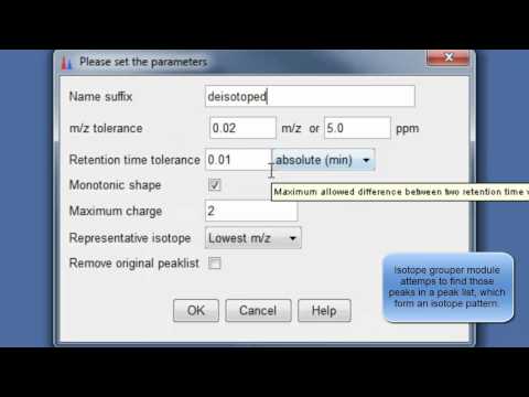
10. Specify parameters for isotope peak grouping
 Specify parameters for isotope peak grouping
11. Align XICs from different sample to one matrix
 Align XICs from different sample to one matrix
12. Specify join aligner parameters
 Specify join aligner parameters
13. [optional] Filter aligned feature matrix with peak list row filter
 Filter aligned feature matrix with peak list row filter
14. [optional] Depending of your experimental design use n minimum peaks in a row (n should be around the number of replicates or samples you expect to be similar) and 2-3 minimum peaks per isotope pattern
 use n minimum peaks in a row
15. [optional] You gap filling the re-analyses missed peaks and fill gaps in the feature matrix
 You gap filling the re-analyses missed peaks and fill gaps in the feature matrix
16. [optional] Depending on experimental design you can normalize your peak intensities to internal standards, TICs or total peak area.
 normalize your peak intensities to internal standards, TICs or total peak area
17. [optional] Specify normalization parameters
 Specify normalization parameters
18. Export your matrix as .csv file for down stream data analysis
 Export your matrix as .csv file for down stream data analysis
19. select file name and parameters you want to export
 select file name and parameters you want to export
 select file name and parameters you want to export
Here is also a video for MZmine 2 documentation:
Metabolomics demo data in Qiita
- Refer to the Qiita documentation about Principal Coordinates Analysis (PCoA) here
GNPS tutorial for MS/MS data annotation
Global Natural Products Social Molecular Networking GNPS web-platform provides public data set deposition and/or retrieval through the Mass Spectrometry Interactive Virtual Environment (MassIVE) data repository. The GNPS analysis infrastructure further enables online dereplication, automated molecular networking analysis, and crowdsourced MS/MS spectrum curation. Each data set added to the GNPS repository is automatically reanalyzed in the next monthly cycle of continuous identification. For more information, please check out the GNPS paper published in Nature Biotechnology by Ming et al 2016 here as well as the video and the ressource on Youtube, and well as on the online documentation
Tutorial: Generation of Molecular Networks in 15 minutes: Exploring MS/MS data with the GNPS Data Analysis workflow
Step 1- Go to GNPS and create an account
Go to GNPS main page in an other window http://gnps.ucsd.edu and create your own account first (important!)
 Login
Login
Step 2- Find a MS/MS dataset on MassIVE (Mass spectrometry Interactive Virtual Environment)
A) Go to GNPS and access the MassIVE datasets repository.
 Login
Login
B) Search for the MassIVE datasets named “GNPS Workshop” (or “GNPS_AMG_SeedGrant” for a larger example with American Gut Projects samples).Explore its content, and copy the MassIVE ID number (MSV)
 Massive
Note: If you want to upload your own data, follow the DorresteinLab youtube chanel, here is the video:
Step 3 - Access to the Data Analysis workflow
Go to back GNPS main page and open the Data Analysis workflow.
 Massive
Step 4 - Configure and launch the Data Analysis workflow
 start the GNPS job
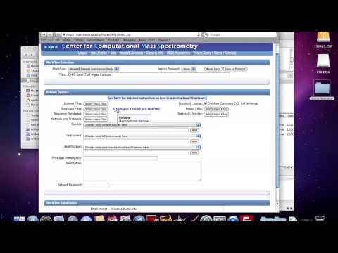
A) Indicate a Title.
B) Clic on Spectrum Files (required)
 Clic on Spectrum Files
C) Go to the Share Files spreadsheet and import the Massive dataset files for the “GNPS workshop” or “GNPS_AMG_SeedGrant” with the Import Data Share (use the MassIVE ID).
 Import
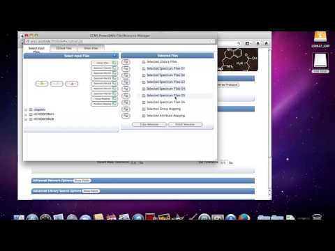
D) Go back to the Select Input Files spreadsheet.
E) Add the files from the imported datasets “GNPS_AMG_SeedGrant” into Spectrum Files G1.
 Select
F) Validate the selection with Finish Selection button.
G) Modifiy parameters to meet high-resolution mass spectrometry: Precursor Ion Mass Tolerance (0.02), Fragment Ion Mass Tolerance (0.02), Min Pairs Cos (0.6), Minimum Matched Fragment Ions (2), Minimum cluster size (use 1)
prepare job
H) Launch the Data Analysis workflow using the Submit button.
Step 5 - Visualize the Data Analysis workflow output
A) Return to GNPS main page and go to the Jobs page. Please find here an example of GNPS data analysis output with American Gut Project.
 view results
 view results
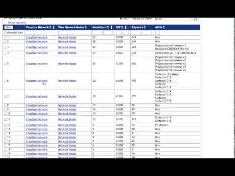
B) Explore the molecule annotated using public spectral library available on GNPS. Click on View All Library Hits.
view results
B) Explore the molecule annotated using public spectral library available on GNPS. Click on View All Library Hits.
 view results
C) Go back to the Status Page
view results
C) Go back to the Status Page
 view results
D) Clic on the View Spectral families and visualize the molecular network 1
view results
D) Clic on the View Spectral families and visualize the molecular network 1
 view results
E) In Node Labels (bottom left), map the parent mass, or the LibraryID, in the molecular network.
view results
E) In Node Labels (bottom left), map the parent mass, or the LibraryID, in the molecular network.
 view results
F) Visualize a first MS/MS spectrum by left-clicking on one node. Visualize a second MS/MS spectrum by right-clicking on a second node.
view results
F) Visualize a first MS/MS spectrum by left-clicking on one node. Visualize a second MS/MS spectrum by right-clicking on a second node.
More on navigating into the results with the following video: